
Color is not just a matter of aesthetics; It is a powerful tool that influences our perception and emotions. In interior design, the right choice of colors can completely transform a space, not only beautifying it, but also affecting the well-being and behavior of those who inhabit it. This phenomenon, known as color psychology, explores how specific hues can evoke emotional responses and create particular atmospheres. Space psychology goes one step further, studying the interaction between the physical environment and the human psyche. Thus, careful selection of a color palette is not only essential for achieving a visually attractive design, but is crucial for creating environments that reinforce the desired purpose of each space.
Importance of color in the psychology of space
Color has a determining role in the psychology of space due to its direct impact on the central nervous system. When entering a space, one of the first aspects we perceive and process is color, which can immediately influence our mood and behavior. Research in color psychology has shown that certain colors can stimulate the mind, increase appetite, reduce the perception of pain, or even lower stress levels.
For example, warm colors such as red, orange and yellow are stimulating and can increase energy and promote interaction, making them ideal for dining rooms and play areas, an example is orange which is usually used to stimulate appetite. . On the contrary, cool colors such as blue, green and lavender have a calming effect and are excellent for bedrooms or spaces dedicated to relaxation. Additionally, neutral tones such as beige, gray and white are versatile and can help balance more vibrant color schemes, creating spaces that facilitate concentration and serenity.
Color theory in interior design
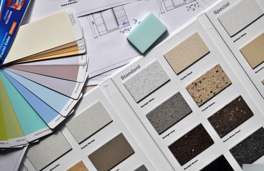
Color theory not only focuses on the selection of individual colors, but also how they interact with each other. This interaction is crucial to creating spaces that are aesthetically pleasing and functionally effective. When designing a space, designers use the color wheel as an essential tool to identify color relationships that harmonize well.
- Analogous colors: They are located next to each other on the color wheel and share a common base color. This combination is soft on the eyes and can create a calm atmosphere. Examples include blue combined with green, ideal for a study or living room.
- Complementary colors: They are opposite each other on the color wheel and when combined, each color appears brighter. This is a great strategy for adding vibrancy to a space without overwhelming it, perfect for attention-grabbing decorative details.
- Triadic scheme: Involves colors that are equidistant on the color wheel, offering high contrast and rich visual harmony. This scheme is vibrant and dynamic, suitable for areas where creativity needs to be stimulated, such as in games rooms or creative spaces.
- Neutral Colors and Their Application: Often underrated, neutral colors can serve as the canvas on which other colors stand out. They can also be used to emphasize other design features, such as natural lighting or the architecture of a space.
Elegir la paleta de colores perfecta
Selecting the perfect palette requires more than just a sense of aesthetics; It involves understanding the purpose of the space and how colors can contribute to that purpose. In offices, for example, you can choose blue tones that encourage concentration and calm. In a home, on the other hand, you might prefer warm tones that promote comfort and hospitality.
When we are talking not only about homes but also about social contexts and a color palette has to be chosen, it is crucial to consider the cultural context of the users of the space. This is especially important in places like international hotels, hospitals, schools and multinational offices, where design must respect and resonate with a diversity of cultural perspectives. Understanding these differences can help avoid misunderstandings and create an environment that is welcoming and respectful to everyone.
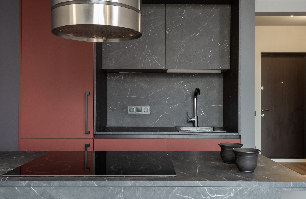
Colors for spaces: beyond decoration
In interior design, the intelligent use of colors can visually manipulate the dimensions of a space, something crucial in places with size limitations or in those where the aim is to maximize the perception of the available space. Light and dark colors play significant roles in how we perceive the size and atmosphere of an area.
- Light Colors to expand spaces: Light colors such as white, cream, and pastels have the property of reflecting light, making a space feel more open and airy. By using these shades on walls, ceilings and large surfaces, a feeling of expansion is created, which can make small rooms appear larger than they really are. In addition, light colors can be an excellent base for a decoration that includes colorful or textured elements, allowing them to stand out without overloading the environment.
- Dark Colors to reduce spatially: On the other hand, dark colors such as dark gray, navy blue or forest green, tend to absorb light. This effect can make walls appear closer than they really are, creating a more intimate and welcoming atmosphere. Using dark colors in a large space can help it feel more collected and less bleak. However, it’s important to use these shades sparingly in small spaces to prevent them from feeling even more cramped.
- Contrast and balance: The key to using colors in interior design lies in balance. For example, a room can have light walls with a dark accent wall, which can add depth and dimension without making the space feel small. Combining light and dark colors can help highlight specific areas of the space and draw attention to architectural features or pieces of art.
- Impact on the perception of furniture and accessories: Colors also influence how we perceive the size and shape of furniture and other decorative elements. Light-colored furniture can appear less bulky, while dark furniture adds visual weight and solidity. This can be used strategically to balance the room or to highlight certain elements as focal points.
Choosing colors in any space should not be taken lightly. Color psychology and color theory are fundamental tools that help designers create spaces that are not only aesthetically pleasing, but also emotionally resonant. By choosing the perfect palette, we are not just painting walls, we are setting scenarios that will affect every day of those who inhabit them. Therefore, a deep understanding of the psychology of space and careful application of color theory are essential for any successful interior design project. Ultimately, the colors we choose are as important as the furniture we place and the spaces we create, since the emotional and functional effect of our environment largely depends on them.
0 Comments